![Perspicuity_new_Dark_Logo-1.png]](https://knowledge.perspicuity.co.uk/hs-fs/hubfs/Perspicuity_new_Dark_Logo-1.png?height=40&name=Perspicuity_new_Dark_Logo-1.png)
This webpart is part of the Percy Web Parts app which is included in the Percy site templates. If you do not see this webpart, add the Percy Web Parts app to your site.
The Separator web part is a great way to structure and break up content on your page. It adds a divider line and some padding in between your web parts to give you a bit more flexibility in the spacing you have.
On top of this, our separator webpart can also bring in text and icons rather than just being a divider line for even more flexibility.
- Add the webpart by editing your page and selecting Separator

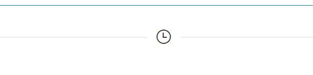
- By default, it will give you the divider and padding like so:

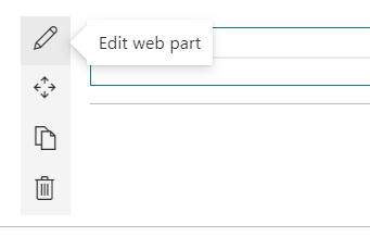
- If you want to configure it further, click on the edit pen on the webpart panel to display these options

- The panel will provide you with the following options:
- Text - Adds some text to the line, depending on the allignment settings
- Icon - Type the name of a Microsoft-provided icon to add to the separator. Use the link below the text box to see the list of available icons
- Use icon - Replaces the text with an icon
- Alignment - To change where the text/icon appears
- Size - To adjust the size of the text/icon being used
- Text Colour - Changes the colour of the divider text. Your theme colours are shown, and you can use hex codes to use a custom colour
- Separator Colour - Changes the colour of the divider line. Your theme colours are shown, and you can use hex codes to use a custom colour